
IupFlatSeparator
| Definition: |
include pGUI.e
Ihandle ih = IupFlatSeparator(string attributes="", dword_seq args={}) |
| Description: |
Creates an interface element that is a Separator, but it does not have native decorations.
It inherits from IupCanvas. For more information on the attributes and args parameters see IupSetAttributes. Returns: the identifier of the created element. |
| pwa/p2js: | Not supported |
| See Also: | IupImage, IupButton, IupToggle, IupLabel |
| Notes: |
The IupFlatSeparator is used internally in IupSplit (since 3.25) and in
IupSbox (since 3.27).
Some examples can be seen in demo\pGUI\IupFlatSample.exw |
| Attributes: | Inherits all attributes and callbacks of the IupCanvas, but redefines a few attributes. |
| BARSIZE | (non inheritable) controls the size of the separator in the opposite direction of its orientation. Default: 5. |
| COLOR | (non inheritable) Changes the color of the separator. Default: "192 192 192". |
| ORIENTATION |
(non inheritable) Indicates the orientation of the separator. Possible values are "VERTICAL" or "HORIZONTAL". Default: "VERTICAL". |
| EXPAND |
(non inheritable) Its behavior depends on the orientation. It will expand in the direction of the separator, but occupying only the available space. |
| STYLE |
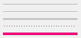
(non inheritable) The separator appearance. Can be: "LINE", "SUNKENLINE", "DUALLINES", "GRIP", "FILL" or "EMPTY". Default: SUNKENLINE. FILL is a rectangle filled with COLOR. EMPTY uses the parent background color only, COLOR is ignored (since 3.27). |
| also | FONT, SIZE+, RASTERSIZE+, CLIENTSIZE, CLIENTOFFSET, POSITION, MINSIZE, MAXSIZE, THEME: also accepted. |
| Example: |
The following image can be seen in demo\pGUI\IupFlatSample.exw.
|
| Callbacks: | Inherits all callbacks of the IupCanvas, but redefines the ACTION callback. |